What is a financial dashboard?
A financial dashboard is a data visualization tool designed to present key financial metrics in a comprehensive and user-friendly interface, sort of like those displays Tony Stark had while flying around in his Iron Man suit.
Unlike those, however, they’re not quite as exclusive: financial dashboards are meant to be accessible to all users, serving as a centralized platform for monitoring, analyzing, and interpreting financial information. By offering a real-time snapshot of your organization's financial performance, these dashboards enable stakeholders to quickly identify trends, monitor progress toward targets, and make well-informed decisions.
If your company is a building, financial dashboards are like windows providing transparent views into specific business areas. These might include cash flow, budget variance, or profit and loss, among others.
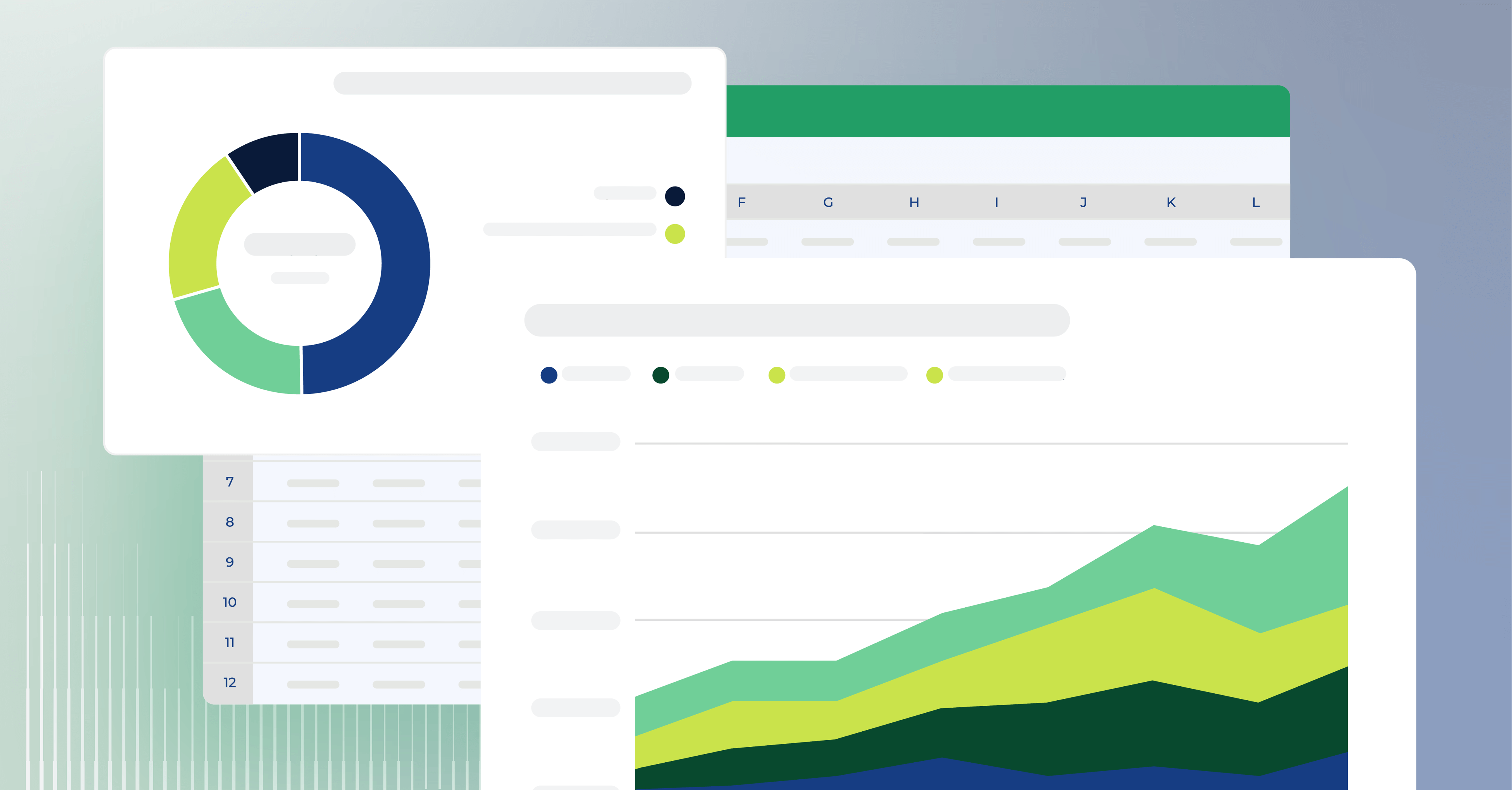
The beauty of a financial dashboard lies in its ability to present complex financial information in a user-friendly manner. With colorful visualizations, charts, and graphs, the dashboard transforms intimidating numbers into a captivating story, making it easier for stakeholders at all levels to understand and act upon the information presented.

Why you need modern financial reporting dashboards
That said, it's important to note that not all financial dashboards are created equal. It's not enough for them to look pretty—you need modern financial dashboards that leverage big data analytics to provide more in-depth insights and information you can take action on.
It's also not enough to present data without providing any meaningful context. While it can certainly be helpful to see important information at a glance, it's critical for financial professionals to understand how each metric connects.
Truly valuable financial dashboards present data in a clean and digestible manner while offering explanatory insights. They synthesize disparate financial and accounting data into one source of truth. Such dashboards are critical to your overall strategy for successful Financial Planning and Analysis (FP&A).
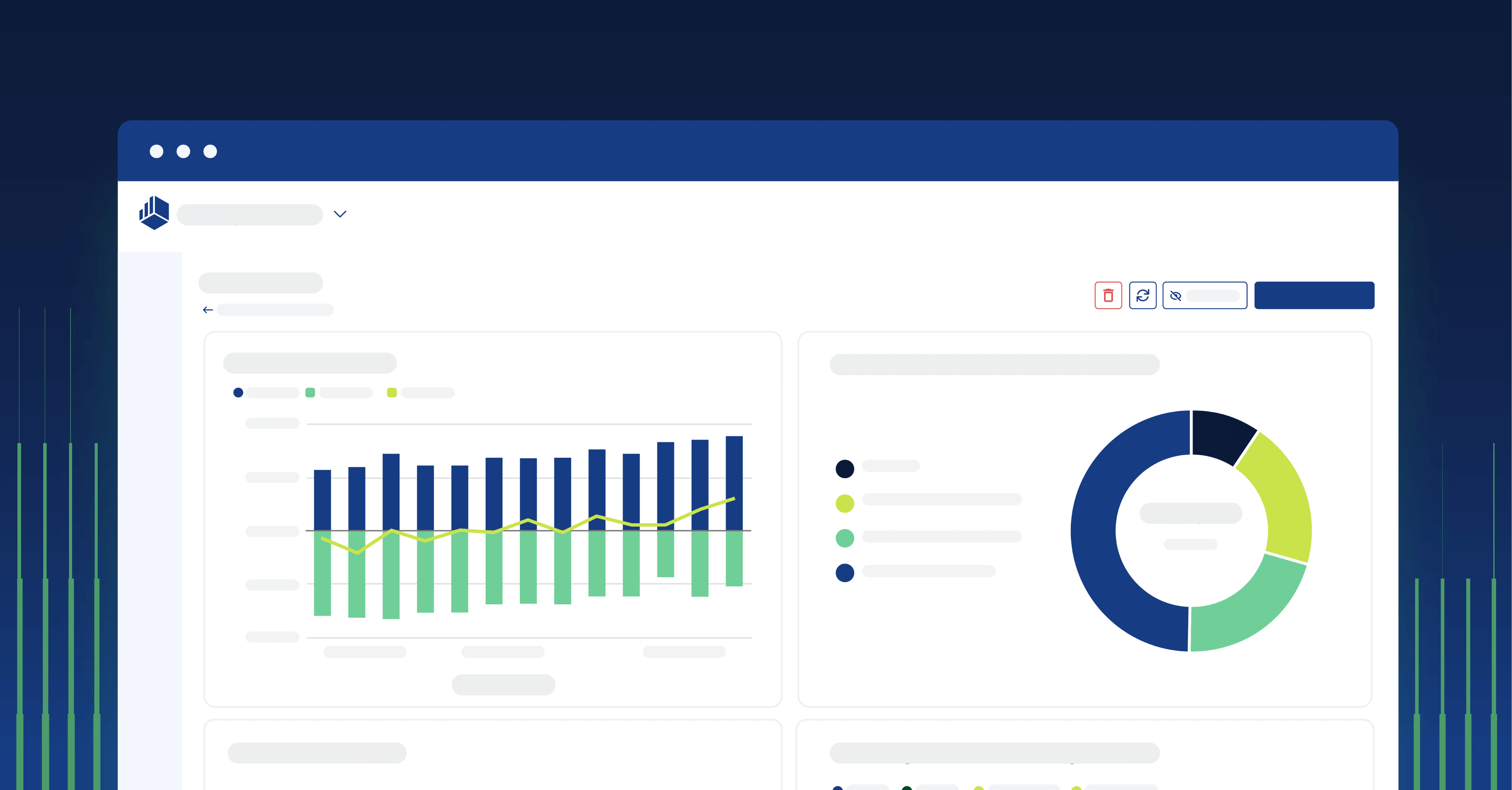
Financial dashboards are a visual tool, so seeing them is the best way to get an idea of what they're all about. Read on to see some of the best financial dashboard examples (all built in Cube) and learn what each template covers.
Financial dashboard examples
CFO dashboard
It's no secret that the role of the CFO is changing.
Previously viewed solely as an accountant, today's CFO is a strategic partner to the CEO, acting as part of a critical dynamic duo that helps direct the company's trajectory.
To do this effectively, however, CFOs need quick access to data on just about every financial aspect of the business. Enter the CFO dashboard, which provides a comprehensive overview of financial data and performance indicators. It may include metrics such as revenue growth, net profit, working capital, free cash flow, and budget variances that CFOs can view on-the-fly.
The CFO of the past was focused on historical data. Now, when everything is in front of them, they can look forward rather than backward and make quick, well-informed strategic decisions that benefit the company's future.
Cash flow dashboard
Cash flow is one of the most important measures of financial health. Using a cash flow dashboard, your business can gain a quick view of inflows and outflows for the specific period being evaluated (usually monthly, quarterly, or annually). Remember that you can create separate cash flow dashboards for different periods for a more holistic view of your business's finances. While one trend may not be apparent over a month, it could be over a quarter.
The cash flow dashboard should include your current cash balance. It should also break down information from your cash flow statement, like cash flow from operations, cash flow from financing, and cash flow from investing activities. Imagine each type of cash flow being clearly defined with a different color—a lot more interesting to take the information in this way than scouring the cash flow statement!
Another piece of information from the cash flow statement that should be included in your dashboard is the net cash flow. Net cash flow is the difference between total cash inflows and outflows for the period.
Your cash runway should be displayed prominently in a cash flow dashboard, especially if you're operating a startup. This is the time you have before running out of liquidity, and it informs whether you need to cut expenses or have room to invest in growth.
Finally, we have the cash conversion cycle and gross profit. The cash conversion cycle looks at the length of time required to convert investments in inventory into liquidity, while gross profit shows how much revenue is left over after factoring in the cost of producing goods.
The formula to calculate the cash conversion cycle (CCC) is as follows:
CCC = days inventory outstanding + days receivable outstanding - days payable outstanding
To calculate gross profit, use this formula:
Gross profit = revenue - cost of goods sold
The information in the cash flow dashboard can be used as a basis for cash flow forecasting, a critical process that will help you plan out inflows and outflows and avoid liquidity shortfalls.
Forecast vs. actuals dashboard
Budget variance analysis is crucial for tightening your budgets so that resources are well-spent. The first requirement for this dashboard is an accurate baseline.
Display the projected or forecasted values for each KPI or metric based on the business's planning and forecasting processes.
Present the actual performance data for each KPI or metric, reflecting the real-world results achieved. This can be displayed alongside the forecasted values for easy comparison.
Include a section highlighting the variance or difference between the forecasted values and the actual performance. This can be shown as both absolute values and percentage variances. Positive variances (when actuals exceed forecasts) can be indicated in green, while negative variances (when actuals fall short of forecasts) can be highlighted in red.
By adopting these practices, decision-makers can easily identify areas that require attention, make informed financial adjustments, and optimize resource allocation to achieve better financial outcomes.
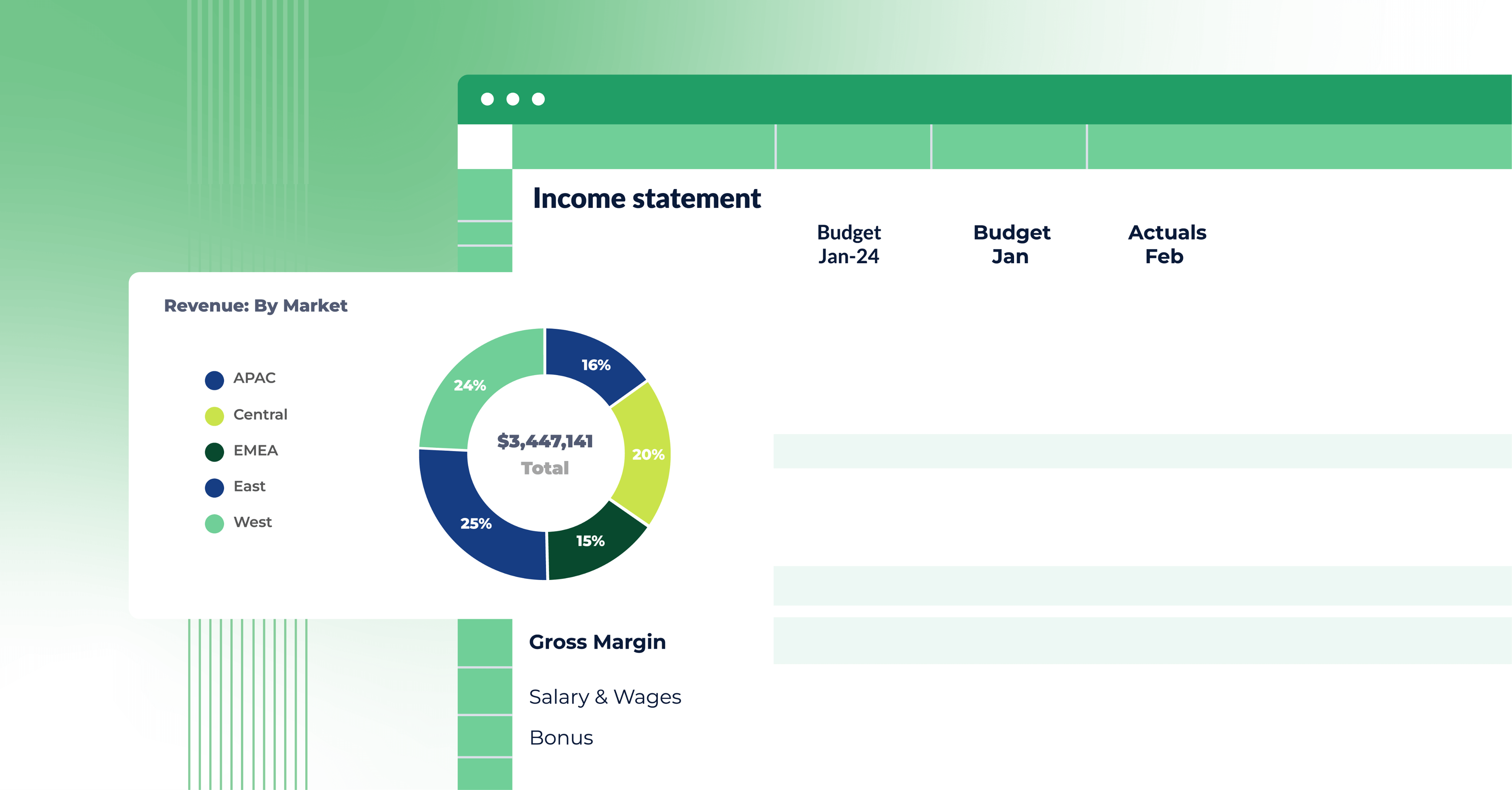
Profit and loss (P&L) dashboard
A profit and loss dashboard provides an overview of the company's financial performance, specifically the revenue, expenses, and net profit or loss. It includes metrics such as gross profit margin, operating income, net profit margin, and EBITDA (Earnings Before Interest, Taxes, Depreciation, and Amortization). Visualizations like line charts and bullet graphs can effectively represent P&L data.
Expense detail analysis dashboard
The expense detail analysis dashboard delves into the details of expenses and helps organizations monitor and analyze their spending patterns. It may provide insights into various expense categories such as payroll, marketing, travel, utilities, etc. By visualizing expenditure data with a finance dashboard, organizations can identify cost-saving opportunities, control expenses, and optimize resource allocation.
Financial reporting dashboard
A financial reporting dashboard consolidates and presents financial data in a format suitable for reporting purposes. It usually includes key financial statements such as the balance sheet, income statement, and cash flow statement, breaking down these complex documents into visualizations that are easy to understand. The dashboard can be customized to highlight specific financial metrics or performance indicators required for reporting to stakeholders, management, or regulatory bodies.
Balance sheet dashboard
The purpose of a balance sheet dashboard is to provide a clear and concise overview of an organization's financial position at a specific point in time. It presents key information from the balance sheet, one of the three primary financial statements.
That includes current and non-current assets like cash, accounts receivable, inventory, property, plant, and equipment, as well as liabilities like accounts payable, loans, and other debts. The balance sheet dashboard also includes equity.
Metrics related to assets and liabilities, such as the working capital ratio, should also be included in the balance sheet dashboard.
CAGR dashboard
A CAGR (Compound Annual Growth Rate) dashboard displays and analyzes individual metrics' growth rates or key performance indicators (KPIs) over a specific period.
By providing a comprehensive view of growth rates over time, a CAGR dashboard enables stakeholders to assess performance, identify growth opportunities, and make informed decisions to drive the organization's success.
For example:
With a CAGR dashboard, you can compare the growth rates of different business segments, products, or regions. This helps identify areas of success and areas that require attention. In this way, a CAGR dashboard helps you prioritize resources.
A CAGR dashboard is also important for evaluating the performance of investment portfolios, individual stocks, or assets. Finally, use a CAGR dashboard to demonstrate the time value of the money function of the underlying finance analytics platform.
Financial performance dashboard
The financial performance dashboard provides a bird's eye view of your business's financial health and operating expenses.
An obvious indicator of financial health is your liquidity, which represents your ability to meet short-term financial obligations and respond to crises. On the financial performance dashboard, liquidity is usually indicated by the working capital ratio (current assets divided by current liabilities).
Operational metrics such as sales, customer satisfaction, and employee productivity are also included in a financial performance dashboard, specifically in the context of their financial impact on the company. Don't forget to include collections metrics like accounts receivable aging, accounts payable aging, and billings.
When you can easily view operational issues, you can quickly fine-tune business processes to boost revenue and collections and free up capital.
The financial performance dashboard also focuses on equity, specifically how it relates to other metrics. Here you'll find the debt-equity ratio and the return on equity. The debt-to-equity ratio is a financial ratio that compares a company's total debt to its total shareholders' equity. It's a measure of the company's financial leverage and indicates the proportion of debt financing relative to equity financing used in operations and investments.
The formula to calculate the debt-to-equity ratio is:
Debt-Equity Ratio = Total Debt / Shareholders' Equity
Return on equity measures a company's profitability relative to its shareholders' equity. In other words, it shows how effectively the company generates profits from the shareholders' investments.
The return on equity (ROE) formula is:
ROE = Net Income / Shareholders' Equity
Designing your financial dashboards
Above are some financial dashboard examples of the main templates used by professionals. But if you need something custom, you can always make your own financial dashboards in Cube. These can be as tailored as you want, including whatever information is needed to address the problems you're looking at.
Follow these steps to design your financial dashboard:
Define the purpose and audience
First, ask what the purpose of your financial dashboard is.
For example, what are the specific financial goals and objectives you would like to achieve using the dashboard? Who is it designed for? Who in the company can surface the stepping stones to achieving those goals by looking at this dashboard? Is it executive management or finance and accounting teams? Which metrics will be relevant to them?
Based on the answers to these questions, you can choose whichever financial dashboard example above fits best. If none of them do, create your own financial dashboard.
Provide context and comparative data
Data is useless in isolation.
Add context to your primary metrics by including benchmarks, targets, or historical data for comparison. Show trends over time and highlight variations from expected values.
You should also provide explanatory text or annotations to help your target audience understand the significance of the data. In other words, don't just display numbers but help interpret them.
Choose the right visualizations
Visualization should be chosen based on the type of information being presented (line charts for trends over time, bar charts for contrasting different categories, etc.)
Ensure responsiveness and interactivity
Design the dashboard to be responsive across different devices and screen sizes. Ensure that it can adjust to different resolutions without sacrificing usability. You'll want to add interactive elements like filters, drill-down functionality, and tooltips that allow your target audience to really explore the data.
Keep it simple and focused
A cluttered finance dashboard defeats the purpose. Highlight the metrics that are most important to decision-making with certain colors while also offering the ability to drill down.
Regularly update and maintain your dashboard
Financial data and metrics change over time, so keeping the dashboard updated with the latest information is essential. Establish a process for regularly updating and maintaining the dashboard to ensure the accuracy and relevance of the displayed data. It doesn't need to be perfect right off the bat. Get feedback from your audience so you can continue working on it until it's as solid as possible.
Conclusion: dashboards you can depend on
When it comes to making smart decisions that drive business growth, high-quality financial data is a critical element. However, if this financial data isn't easily accessible, it can prevent you from obtaining the insights you need to mitigate any potential issues and set your business up for success.
Effective financial dashboards (like the ones described above) are a great way to ensure stakeholders at all levels can understand financial metrics, how these metrics connect, and how to act upon the information in a way that benefits your business.
Ready to get started? Cube's Dashboard Creator empowers you to see and explore your data your way. Request a free demo today to learn how Cube can help you easily access, filter, and visualize data to make better decisions, faster.